-
The Forum works well on MOBILE devices without an app: Just go to: https://forum.tsptalk.com
-
Please read our AutoTracker policy on the IFT deadline and remaining active. Thanks!
-
$ - Premium Service Content (Info) | AutoTracker Monthly Winners | Is Gmail et al, Blocking Our emails?
Find us on: Facebook & X | Posting Copyrighted Material
-
Join the TSP Talk AutoTracker: How to Get Started | Login | Main AutoTracker Page
You are using an out of date browser. It may not display this or other websites correctly.
You should upgrade or use an alternative browser.
You should upgrade or use an alternative browser.
coolhand's Account Talk
- Thread starter coolhand
- Start date
coolhand
TSP Legend
- Reaction score
- 530
Preliminary reading on the auto-tracker signals shows the Total Tracker with a total stock allocation of just 40.37%. That's as of Wednesday's close. We're slowly reigning in our exposure. Statistically when that number gets below 40% the market tends to go up on a week over week basis. Between that low number and liquidity this market could continue to defy gravity.
MrJohnRoss
Market Veteran
- Reaction score
- 58
Preliminary reading on the auto-tracker signals shows the Total Tracker with a total stock allocation of just 40.37%. That's as of Wednesday's close. We're slowly reigning in our exposure. Statistically when that number gets below 40% the market tends to go up on a week over week basis. Between that low number and liquidity this market could continue to defy gravity.
"Defy gravity". That's the best term I've heard for this market all day! :laugh:
coolhand
TSP Legend
- Reaction score
- 530
"Defy gravity". That's the best term I've heard for this market all day! :laugh:
Before the market turned higher last month, I was very patient with my stock allocation. I wanted to give the market every chance to prove the bull was still in charge because I expected higher prices down the road. But once everything was convincingly turned down, it forced many traders to the sidelines. Once that was accomplished, it was off to the races yet again. This market is very deceptive. But I'll make it up eventually.
coolhand
TSP Legend
- Reaction score
- 530
The NAAIM (National Association of Active Investment Managers) sentiment survey has triggered a very short term sell signal. Market exposure jumped to 78.5% from 47.5% the previous week. This often implies some short term selling is very near at hand. I stress “short term”, which means 1 to 2 days. Mark Young at Trader’s Talk has a white paper that explains their study of this particular survey. His white paper can be found here. At this moment in time I'm thinking if this dip occurs, I may buy it, although I'll probably only take a 50% stock exposure in TSP. Keep in mind that any dip may not be easy to buy given our IFT restrictions. In other words the sell off could come after our IFT cut off either today (Friday) or Monday. I hope not, but it may. If you're already in the market, I'd not worry about this signal.
coolhand
TSP Legend
- Reaction score
- 530
While sentiment may be bearish is some areas, liquidity continues to ramp higher. It's going to be real difficult under these conditions to buy a dip. Since this rally began, there are now 6 gaps in the S&P 500 that need to be filled. And there's a double top formation in play too. But the way this market is acting, we could go much higher from here.
coolhand
TSP Legend
- Reaction score
- 530
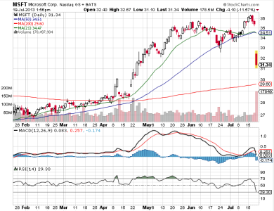
Since this market began rallying a few weeks back, it's getting harder and harder to find undervalued, quality stocks. But I see that Microsoft took a big hit today and that puts it back on my radar as a potential buy. I've got a "buy under" price of $29, which is still well below what it's trading at today, but there may be more downside yet to come.
coolhand
TSP Legend
- Reaction score
- 530
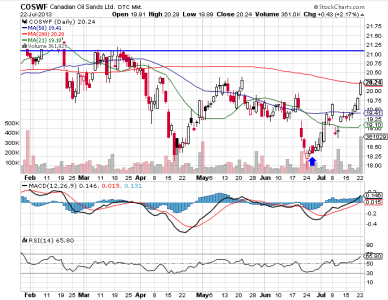
I posted a chart of COSWF on Jun 27th when I thought it was ready to head back up (blue arrow). In less than a month price has reached the 200 day moving average and appears poised to head higher (it's up about 10% now). I have a blue line above the $21 area as a potential short term target. MACD and RSI are still pointing higher.
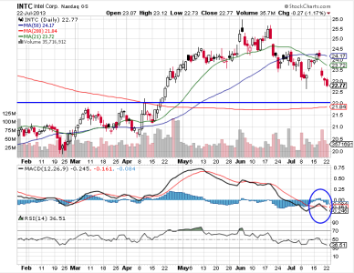
I added Intel Corp. to my model portfolio in this week's premium analysis. I wasn't ready to buy, but I feel this is a good stock to watch for possible entry in the days/weeks ahead. I have a buy under price of $22 right now and that's not far away from today's closing price. The 200 day moving average is not far below my buy price, but until those technical indicators begin to turn back up, I'd be patient with this one.
coolhand
TSP Legend
- Reaction score
- 530
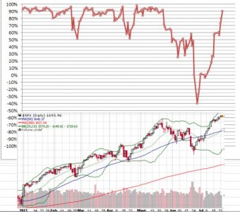
Most of us realize that liquidity is boosting this market, but what does that look like on a chart? I have two charts shown below. The upper chart shows what liquidity has been doing in general. On the left of the liquidity chart are percentage readings. There is a zero line in the middle. The upper or positive half shows liquidity in "expansion". Below the zero line is liquidity in "contraction". Don't ask me what the values of liquidity are because I don't know exactly. I'm just showing direction and relative strength. The chart below is the S&P 500. Between the two charts I'm showing how liquidity has affected price on the S&P 500 since the beginning of the year.

RealMoneyIssues
TSP Legend
- Reaction score
- 101
Nice charts CH... wish I would have known about the reversal of liquidity at the end of June... maybe my "system" wouldn't have kept me short for so long...
Where did you get it?
Where did you get it?
MrJohnRoss
Market Veteran
- Reaction score
- 58
Most of us realize that liquidity is boosting this market, but what does that look like on a chart? I have two charts shown below. The upper chart shows what liquidity has been doing in general. On the left of the liquidity chart are percentage readings. There is a zero line in the middle. The upper or positive half shows liquidity in "expansion". Below the zero line is liquidity in "contraction". Don't ask me what the values of liquidity are because I don't know exactly. I'm just showing direction and relative strength. The chart below is the S&P 500. Between the two charts I'm showing how liquidity has affected price on the S&P 500 since the beginning of the year.
View attachment 24610
Wow, if that doesn't show "cause and effect", I don't know what does!
Intrepid_Timer
TSP Talk Royalty
- Reaction score
- 79
Nice charts, but how does one decide to get in or our based on "liquidity". After one day up or down? Two days? After the previous low or high is taken out? We want more CH, we want more!!! 
coolhand
TSP Legend
- Reaction score
- 530
Nice charts, but how does one decide to get in or our based on "liquidity". After one day up or down? Two days? After the previous low or high is taken out? We want more CH, we want more!!!
There is no way that I am aware of to use a chart like this by itself in terms of hard signals. To me, it's one piece of a bigger picture. It's about context. What this chart tells me is to try and avoid counter-trend trades else one would be fighting the Fed. As long as liquidity is in expansion, and especially when it's at higher levels of expansion, the downside is generally going to be limited. On the liquidity chart we can see a relatively brief period of time where liquidity dropped into contraction and the market followed suit by selling off. Many longer term systems rolled over to sell conditions during that time. I exited the market myself well before the lows, but ran out of IFTs in doing so (in June). But the market turned hard not long after many traders decided to exit and hasn't looked back since. It's very tricky with TSP to time that kind of move. And my longer term system didn't move back to a buy for more than 2 weeks after the rally began. There's no doubt that this year (so far) has favored buy and hold strategies.
Coolhand...Most of us realize that liquidity is boosting this market, but what does that look like on a chart? I have two charts shown below. The upper chart shows what liquidity has been doing in general. On the left of the liquidity chart are percentage readings. There is a zero line in the middle. The upper or positive half shows liquidity in "expansion". Below the zero line is liquidity in "contraction". Don't ask me what the values of liquidity are because I don't know exactly. I'm just showing direction and relative strength. The chart below is the S&P 500. Between the two charts I'm showing how liquidity has affected price on the S&P 500 since the beginning of the year.
View attachment 24610
CH, Since liquidity appears to be hitting the 90 level, would you expect a topping and possible contraction and corresponding Market decline? But Ben has said he will continue the pumping ?? Thanks..
coolhand
TSP Legend
- Reaction score
- 530
CH, Since liquidity appears to be hitting the 90 level, would you expect a topping and possible contraction and corresponding Market decline? But Ben has said he will continue the pumping ?? Thanks..
Looking at the chart we can see that liquidity can remain at very high levels for weeks/months at a time. As far as contraction goes, the contraction this market saw in June was the first time liquidity fell into contraction since July of 2012. It does not have to go into contraction to get some selling pressure though. Just pull back on the throttle enough to allow the sellers to overtake the buyers. While I realize what the Fed said about keeping the pumping going, it's not what they say so much as what they eventually do. For now, I just watch the charts for a clue.
DreamboatAnnie
TSP Legend
- Reaction score
- 997
Hi Coolhand,
I have been in G for some time now. I decided my old strategy needed to be tweeked. I have been studying the Indices underlying the TSP funds and have decided to start using the following strategy to time market entry and exits. Will wait for slow stochastic ( SS) to dip below 20 and but preferably to 15 to enter market, stay in until SS reaches at least 90 and then exit but only exit when MACD crosses signal line ... or just before that point if it looks like it is going to turn down ..i.e. like at a high point of a double camel hump on the zero baseline. Also looking at telltale candle patterns for confirmation. Trying to stick to a simple strategy and follow through on strategy. I have tried to test this back a year and it looks to be a good strategy. Will likely test it back on DWCPF in 2011 and 2008 major drops to see if the exit strategy would have worked to avoid major losses.
There are so many methods and indicators that could be used for a strategy, but is there any indicator or factor that pops out as Something that I might additionally want to consider? Thx DB Annie
coolhand
TSP Legend
- Reaction score
- 530
Hi Coolhand,
I have been in G for some time now. I decided my old strategy needed to be tweeked. I have been studying the Indices underlying the TSP funds and have decided to start using the following strategy to time market entry and exits. Will wait for slow stochastic ( SS) to dip below 20 and but preferably to 15 to enter market, stay in until SS reaches at least 90 and then exit but only exit when MACD crosses signal line ... or just before that point if it looks like it is going to turn down ..i.e. like at a high point of a double camel hump on the zero baseline. Also looking at telltale candle patterns for confirmation. Trying to stick to a simple strategy and follow through on strategy. I have tried to test this back a year and it looks to be a good strategy. Will likely test it back on DWCPF in 2011 and 2008 major drops to see if the exit strategy would have worked to avoid major losses.
There are so many methods and indicators that could be used for a strategy, but is there any indicator or factor that pops out as Something that I might additionally want to consider? Thx DB Annie
Hi Annie. I also use support and resistance lines as well as the 21, 50 and 200 day moving averages. These are elements that are watched by many traders and investors to help determine entry and exits. Along with these technical indictors I always look at sentiment to help frame the broader picture too. I have found that our own sentiment survey is one of the most predictive indicators out there.
coolhand
TSP Legend
- Reaction score
- 530
Nice charts CH... wish I would have known about the reversal of liquidity at the end of June... maybe my "system" wouldn't have kept me short for so long...
Where did you get it?
Stocktiming.com is where I keep an eye on it.
Similar threads
- Replies
- 0
- Views
- 138
- Replies
- 1
- Views
- 172
