-
The Forum works well on MOBILE devices without an app: Just go to: https://forum.tsptalk.com
-
Please read our AutoTracker policy on the IFT deadline and remaining active. Thanks!
-
$ - Premium Service Content (Info) | AutoTracker Monthly Winners | Is Gmail et al, Blocking Our emails?
Find us on: Facebook & X | Posting Copyrighted Material
-
Join the TSP Talk AutoTracker: How to Get Started | Login | Main AutoTracker Page
You are using an out of date browser. It may not display this or other websites correctly.
You should upgrade or use an alternative browser.
You should upgrade or use an alternative browser.
alevin's account talk
- Thread starter alevin
- Start date
RealMoneyIssues
TSP Legend
- Reaction score
- 101
Alevin, prayers for you and your family in these difficult times. Thank you for sharing and good luck!
-RMI
Sent from my Z959 using Tapatalk
-RMI
Sent from my Z959 using Tapatalk
alevin
Market Veteran
- Reaction score
- 97
I appreciate the prayers and warm thoughts, Fog, jp, rmi. thank you all. I'm focusing on home life/selfcare today, housebound with steady rain. will call brother and wife tonight, am certain they are fully occupied during daylight hours with preparations for the move to yet another local-area rental by end of the month, to the extent they have energy and strength. generally check in on the parents by phone on Sundays. not easy when we are spread from coast to coast to do more than that. 3 more years to retirement date and more time flexibility for being with family, tho I could bail end of this year if it became necessary.
Hope things get better for your family1 Will certainly add them to our prayer list. My mother-in-law just had a back procedure to repair her L-2 vertebrae by using a needle procedure to restore height of the vertebrae and filling the space with bone cement. Doesn't always work but was miraculous for my MIL. Pain was greatly reduced! Out-patient procedure.
DreamboatAnnie
TSP Legend
- Reaction score
- 1,042
Alevin, So sad to hear about what has happened to your brother and sister-in-law. I will pray for you and your family. I also hope your mom's surgery was effective and that she will recover well. Keep up the faith and strength for your family. Hoping things get better. Wishing you many blessings and peace.
alevin
Market Veteran
- Reaction score
- 97
Time to post something in my thread, finally have something sort of positive to say. Nothing improved with sibling situation, still barely working, not quite unemployed but almost. can't draw unemployment, no success finding another job that pays what he needs for basic barebones handtomouth living expenses. If family wasn't helping, they'd be homeless and starving, would have been months ago without family help. despite having been gainfully employed his entire adult life, 23 enlisted years in the Navy, post-Navy as big truck diesel mechanic. divorce, child support-nothing left from his pension for him to live on. literally nothing. ex has claimed it all on behalf of remaining child still at home, 4 more long years til the son graduates high school. no recourse at law. no financial resources to fight back. And no the guy that attacked and nearly beat him to death with iron bar a couple months ago-has not been apprehended. local law has no idea where to start. small mountain town, northern VA, lower-middle/middle- middle class economy, formerly thought to be a safe community. no more, never safe again.
Meanwhile, two positives: 1) my mom's out-patient day-surgery on her spine went pretty well, not perfect but far more liveable in terms of pain and mobility at age 83. 2) Charts I watch say I might get a chance to wade into this beast of a market not too long from now. not moving til I see whites of its eyes.
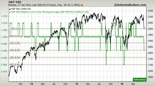
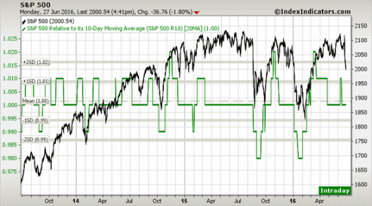
This is the early warning chart 5max10ma. I'm waiting til the 10ma x 20 ma looks similar, drops to at least -1 std dev. If the 5-10 ma chart drops to -3 or -4 std deviation first, I'll wait until the 10-20ma looks similar to that, ie drops to -2 sd. second chart shows why' I'm willing to wait for it. based on last August and January index behavior both, I would be putting it in a chunk at a time, not all at once.


alevin
Market Veteran
- Reaction score
- 97
Hi Whipsaw-
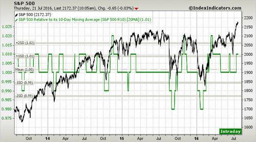
This is same chart posted the other day, for ease of adding some interp and discussion per Whipsaw's request.
So this chart shows the movement of the SP500 (black line=the market index our C fund tracks), over the past 3 years. that's what the right side chart numbers represent.
The green line measures movement of the 10day moving average relative to the 20day moving average, each day. It is not a simple metric that one can easily run for themselves in a spreadsheet or charting software, userque tried awhile back to figure out the formula that creates the green line from the moving averages. Even he failed, because somehow it measures 10 and 20 day moving averages of each and every individual company in the SP500 and integrates them into the green line that you see.
The level of the green line is essentially a measure of volatility and risk from what I can understand, based on statistical movement above and below the mean of the 10day moveing average relative to the 20day moving average. the left hand side of the chart measures the ratio of the 2 moving averages. 1 would be the value when the 10 and 20day moving averages are the same value. that is the mean/average of the averages.
When the 10day moving average drops below the 20day moving average, you move down below 1, but the green line formula is such that the line doesn't drop until there is a measurable/meaningful statistical difference (-1 standard deviation) in the ratio of the 2 moving averages (e.g. .99), relative to their mean, in statistical terms.
The farther one gets from the mean of 1.0, +/- 1sd, +/- 2sd), the bigger the risk of a snapback to the mean or drop below the mean of the moving averages, ie, when you see a pop up of the green line to the 1sd or more rarely the 2sd level (November 2014, November 2015), the greater the probability that a drop is coming in not too distant future. It's not perfect on timing, just probability that it's in the air.
On the down side, when I see a -1sd is a probably decent entry point if out. -2sd level is even better, but as you can see from the drops last August and in January, it would appear to be best to wade in a chunk at a time, in case an aftershock drop is coming.
the charts I've posted previously have often showed the 5day moving average/10 day moving average chart as well as the 10x20day moving average chart. the shorter timeframe tends to give faster exit/entry signals both directions with the 1sd and -1sd pops and drops, but there also seem to be more whipsaw action in those charts so I've started focusing mainly on the bigger, slower signals for myself, since they tend to be longer lasting trend indicators. which fits the 2x/month move limits a bit better, in my mind.
chart pattern I watch for good entry point. longtime coming but its getting closer by the day. something cautionary for all those currently in CSI to consider:
View attachment 38898
This is same chart posted the other day, for ease of adding some interp and discussion per Whipsaw's request.
So this chart shows the movement of the SP500 (black line=the market index our C fund tracks), over the past 3 years. that's what the right side chart numbers represent.
The green line measures movement of the 10day moving average relative to the 20day moving average, each day. It is not a simple metric that one can easily run for themselves in a spreadsheet or charting software, userque tried awhile back to figure out the formula that creates the green line from the moving averages. Even he failed, because somehow it measures 10 and 20 day moving averages of each and every individual company in the SP500 and integrates them into the green line that you see.
The level of the green line is essentially a measure of volatility and risk from what I can understand, based on statistical movement above and below the mean of the 10day moveing average relative to the 20day moving average. the left hand side of the chart measures the ratio of the 2 moving averages. 1 would be the value when the 10 and 20day moving averages are the same value. that is the mean/average of the averages.
When the 10day moving average drops below the 20day moving average, you move down below 1, but the green line formula is such that the line doesn't drop until there is a measurable/meaningful statistical difference (-1 standard deviation) in the ratio of the 2 moving averages (e.g. .99), relative to their mean, in statistical terms.
The farther one gets from the mean of 1.0, +/- 1sd, +/- 2sd), the bigger the risk of a snapback to the mean or drop below the mean of the moving averages, ie, when you see a pop up of the green line to the 1sd or more rarely the 2sd level (November 2014, November 2015), the greater the probability that a drop is coming in not too distant future. It's not perfect on timing, just probability that it's in the air.
On the down side, when I see a -1sd is a probably decent entry point if out. -2sd level is even better, but as you can see from the drops last August and in January, it would appear to be best to wade in a chunk at a time, in case an aftershock drop is coming.
the charts I've posted previously have often showed the 5day moving average/10 day moving average chart as well as the 10x20day moving average chart. the shorter timeframe tends to give faster exit/entry signals both directions with the 1sd and -1sd pops and drops, but there also seem to be more whipsaw action in those charts so I've started focusing mainly on the bigger, slower signals for myself, since they tend to be longer lasting trend indicators. which fits the 2x/month move limits a bit better, in my mind.
FogSailing
Market Veteran
- Reaction score
- 61
Nice chart and explanation alevin!!
FS
FS
Cactus
TSP Pro
- Reaction score
- 38
True, but it always seems that by the time I board the boat I get on ends up sinking.You're most welcome! hope it makes a difference. I've missed the boat on those grand opportunities myself so far. waiting for the next boat to catch and take a ride. there will be other boats come along, that much we know.
alevin
Market Veteran
- Reaction score
- 97
When in risk of sinking, it's better to either get the bailing bucket working, or else offload onto the lifeboat (G), Cactus.True, but it always seems that by the time I board the boat I get on ends up sinking.
My first choice is to limit losses by making use of the lifeboat, it may take awhile before that next bigger boat comes along, and you've regained most of the losses in the meantime but very slowly, in the meantime, you're only hurt a little, if you make use of the lifeboat quickly enough.
others would prefer to use the bailing bucket (alternative methods for recouping losses-like hold bigger losses until market comes back up to meet them where they're holding pricewise), or do incremental new investment into the fund that lost ground.
alevin
Market Veteran
- Reaction score
- 97
Hi whip. northman site? Not sure what you are looking at. the site with the charts I've been posting has the website embedded at top right of the chart. Indexindicators.com. have no fear, charts are here-and they are indeed giving early warning on the 5 x 10 ma chart, I guess I should post charts a little more frequently. will work on posting when there is meaningful move. the 5 x 10 chart moved a bit last week but hasn't hurt anyone much yet. more to come tho, I'm thinking. We shall see, even with these indicators, whipsaws do show up, which is why I went to the 10 x20 ma chart to avoid whipsaws to extent possible.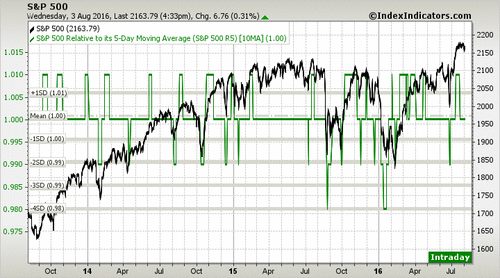
The 10 x 20 ma chart is still hanging up there in midair at the first standard deviation, hasn't mean-reverted yet, like the 5 x 10 ma chart did last week. I'm waiting for the drop to at least the -1 standard deviation on the 10-20. Patiently. sorta. :smile: It may come in August just like it did last year.
Here's what the 10-20 chart looks like as of today-still. S&P 500 vs S&P 500 Relative to its 10-Day Moving Average (S&P 500 R10) | Stock Market Indicators

The 10 x 20 ma chart is still hanging up there in midair at the first standard deviation, hasn't mean-reverted yet, like the 5 x 10 ma chart did last week. I'm waiting for the drop to at least the -1 standard deviation on the 10-20. Patiently. sorta.
Here's what the 10-20 chart looks like as of today-still. S&P 500 vs S&P 500 Relative to its 10-Day Moving Average (S&P 500 R10) | Stock Market Indicators
Similar threads
- Replies
- 0
- Views
- 153

