Since 2008, there have been numerous policy manipulations to stimulate growth in the economy since 2008. One of them is Quantitative Easing (QE), which came in several phases through the years. Another policy maneuver was the Zero Interest Rate Policy (ZIRP). ZIRP is a method of stimulating growth while keeping interest rates at or close to zero. QE and ZIRP were both expected to help stimulate the economy, but regardless of what the media may tell us, they have been ineffective.
And it isn't as though there wasn't evidence of the doomed nature of policies such as these. After two decades of slow growth, the Bank of Japan decided to employ a zero interest rate policy (ZIRP) to combat deflation and promote economic recovery. We know how well that went. The UK is trying to do the same thing.
Here's a quote from Albert Einstein; Insanity: doing the same thing over and over again and expecting different results.
I've shown you some long term charts recently that show the S&P 500 rolling over after about 8 years of failed stimulus plans. They have created a huge bubble that is creating an enormous divergence that is not likely to end well for those holding stocks. Or even bonds.
They don't want it to collapse so they will continue to do everything they can think of to extend the bubble. Now that rates are at zero (with no bullets left), the Fed is considering a Negative Interest Rate Policy (NIRP).

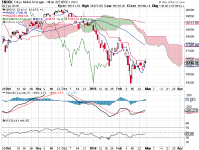
Very recently, the Bank of Japan’s implementation of NIRP generated a brief rally in Japanese stocks that eventually gave way to a 10% decline. Now it's trying to recover once again. But the Tokyo Nikkei Average is still in a down trend.
Some EU members have tried NIRP too, with similar results.
The confidence that Central Banks can steer us out of a monetary disaster has been shaken. They have dug themselves (and us) into a hole and they want to keep digging.
How long can it last?
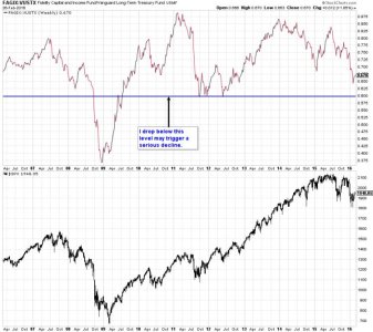
That is impossible to predict. But here's a chart that I am watching with interest:

This chart represents a confidence indicator, which is calculated by dividing the average yield on high-grade bonds by the average yield on intermediate-grade bonds. The discrepancy between the yields is indicative of investor confidence. Barron's has a confidence index similar to this one.
I have drawn a line at a level that should the signal have a negative cross, could trigger a much bigger decline than we've seen already.
But bonds are another arena that have been manipulated mercilessly. Still, it bears watching. This chart suggests that a deep decline could be weeks away. It may or may not happen this year. But January was a negative month and that does not bode well for 2016.
I cannot predict what the future holds with any serious precision. But I can recognize risk. And I see plenty of that reflected in these charts.
And it isn't as though there wasn't evidence of the doomed nature of policies such as these. After two decades of slow growth, the Bank of Japan decided to employ a zero interest rate policy (ZIRP) to combat deflation and promote economic recovery. We know how well that went. The UK is trying to do the same thing.
Here's a quote from Albert Einstein; Insanity: doing the same thing over and over again and expecting different results.
I've shown you some long term charts recently that show the S&P 500 rolling over after about 8 years of failed stimulus plans. They have created a huge bubble that is creating an enormous divergence that is not likely to end well for those holding stocks. Or even bonds.
They don't want it to collapse so they will continue to do everything they can think of to extend the bubble. Now that rates are at zero (with no bullets left), the Fed is considering a Negative Interest Rate Policy (NIRP).

Very recently, the Bank of Japan’s implementation of NIRP generated a brief rally in Japanese stocks that eventually gave way to a 10% decline. Now it's trying to recover once again. But the Tokyo Nikkei Average is still in a down trend.
Some EU members have tried NIRP too, with similar results.
The confidence that Central Banks can steer us out of a monetary disaster has been shaken. They have dug themselves (and us) into a hole and they want to keep digging.
How long can it last?
That is impossible to predict. But here's a chart that I am watching with interest:

This chart represents a confidence indicator, which is calculated by dividing the average yield on high-grade bonds by the average yield on intermediate-grade bonds. The discrepancy between the yields is indicative of investor confidence. Barron's has a confidence index similar to this one.
I have drawn a line at a level that should the signal have a negative cross, could trigger a much bigger decline than we've seen already.
But bonds are another arena that have been manipulated mercilessly. Still, it bears watching. This chart suggests that a deep decline could be weeks away. It may or may not happen this year. But January was a negative month and that does not bode well for 2016.
I cannot predict what the future holds with any serious precision. But I can recognize risk. And I see plenty of that reflected in these charts.
