MrJohnRoss' Account Talk

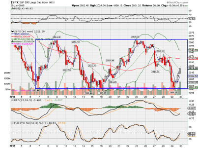
Here's an updated graph of the 60 min S&P 500. Looks like we may tag the bottom of the box again. If we fall out of the box at the bottom, then the December low would be the next test. Let's hope we don't have to drop that low.

The RSI is suggesting we are getting near oversold levels if we fall much further, so that may mean a buying opportunity is approaching.


View attachment 32213

That's a very good synopsis-chart, up until today, I was not expecting another test of the recent lows, but that's a beautiful example of a quad-low with a minor double in the middle (or an M) and I consider this a gem. I haven't discussed this, but there is discord when comparing the indexes side-by-side and, I'm giving time for the markets to equalize and price in the data, but at some point in time things need to turn-around. Sort of a "Sh!t or get off the pott" scenario.
 
That's a very good synopsis-chart, up until today, I was not expecting another test of the recent lows, but that's a beautiful example of a quad-low with a minor double in the middle (or an M) and I consider this a gem. I haven't discussed this, but there is discord when comparing the indexes side-by-side and, I'm giving time for the markets to equalize and price in the data, but at some point in time things need to turn-around. Sort of a "Sh!t or get off the pott" scenario.

Funny, I was thinking along the same lines, up until today... that the market appeared to be a dampening sinusoidal wave. Then today it came completely unraveled, which was rather disappointing. Not a red flag yet, but the yellow caution flag is out.
 
Here's an updated graph of the 60 min S&P 500. Looks like we may tag the bottom of the box again. If we fall out of the box at the bottom, then the December low would be the next test. Let's hope we don't have to drop that low.

The RSI is suggesting we are getting near oversold levels if we fall much further, so that may mean a buying opportunity is approaching.


View attachment 32213

Once again, I'm amazed that we hit the bottom of the box, and immediately bounced higher today.

This will all end someday soon...
 
Once again, I'm amazed that we hit the bottom of the box, and immediately bounced higher today.

This will all end someday soon...

Looks like an inverse h&s forming. if it can break and hold that 2063 level we could see SPX break out to 2150. What I'm hoping to see ;)
 
Tomorrow is the last trading day for January. One of the things that's been reinforced in my mind with this year's trading is to mentally give even less weighting to historical averages. So far, the historical odds of a certain day/week/month being positive/negative have been shot to hell. Perhaps this year is an anomaly, but the averages just haven't panned out like I thought they might. I normally didn't pay a whole lot of attention to them, and now I know why. I haven't performed any kind of statistical analysis on it, but I'd be surprised if it wasn't pretty much a 50/50 crapshoot.

Let's see how tomorrow pans out. Historically, tomorrow, Jan 30th is considered a "Bullish" day. Here are the historical odds of a positive close:

DJIA: 62%
S&P: 67%
Nasdaq: 62%
R1K: 60%
R2K: 77%

Personally, if I were a betting man, I would bet on a higher close tomorrow. The reason has less to do with history, and more to do with what I see in the charts. To me, I see the gas pedal being pushed down, and the tachometer going up from a slightly oversold position.
 
One other interesting note...

According to the Stock Traders Almanac, every down January on the S&P since 1950, without exception, preceded a new or extended bear market, a flat market, or a 10% correction.

Ominous historical data indeed.
 
Updated graph of the S&P 500. You know, if this keeps up, I have the perfect strategy...

Buy when it reaches the bottom of the box. Sell when it reaches the top of the box.

I think even a 3rd grader could figger that one out. :toung:


$spx.png
 
One other interesting note...

According to the Stock Traders Almanac, every down January on the S&P since 1950, without exception, preceded a new or extended bear market, a flat market, or a 10% correction.

Ominous historical data indeed.

Then tomorrow should be a banner day... or this is going to be a rough year :)
 
Updated graph of the S&P 500. You know, if this keeps up, I have the perfect strategy...Buy when it reaches the bottom of the box. Sell when it reaches the top of the box.I think even a 3rd grader could figger that one out. :toung:
Oh Oh! :worried: Time for it to stop working then.
 
One other interesting note...

According to the Stock Traders Almanac, every down January on the S&P since 1950, without exception, preceded a new or extended bear market, a flat market, or a 10% correction.

Ominous historical data indeed.

I know it isn't the S&P, but the C fund was down 3.45% in January 2014. The C fund finished with a 13.78% gain for 2014.
 
I know it isn't the S&P, but the C fund was down 3.45% in January 2014. The C fund finished with a 13.78% gain for 2014.

Good observation. The STA was obviously published prior to the end of the year, so it didn't have end of year data for that statement. I stand corrected.

Rules and exceptions were meant to be broken, especially when we have a market that's being manipulated by the Fed.

Which brings us to another rule to follow... Don't fight the Fed. :nuts:
 
The U.S. is apparently going the way of Europe. Global deflation appears to be at the doorstep. Interest rates gapped down this morning. 10-year Treasuries hit a low of 1.666.

666??? That's the sign of the devil!

If you're holding the F Fund, you're a happy camper.

The Fed is going to have a hard time justifying raising interest rates later this year, IMHO.
 
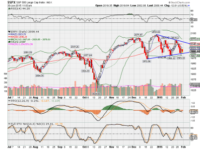
Graph of the S&P, showing a consolidating triangle pattern. Notice that the Bollinger Bands are also contracting. This is known as a "coiling" pattern, where the market is coiling up like a snake, ready to jump out at ya. Which direction is anyone's guess, but the market appears to have a downward bias at this point. Eventually this pattern is going to break, as they all must.


$spx.png
 
The big boy squeeze is on! At this point I'll take either way, with 50% sitting in the "G" fund I'll ride it all the way down before making a move back in with that $$$
 
Nice chart and commentary. Certainly, many traders got caught leaning the wrong way today.

Unfortunately, I didn't get even get out of the G Fund this month. Historically, I am not good with volatility and it was probably wise to stay put.

Graph of the S&P, showing a consolidating triangle pattern. Notice that the Bollinger Bands are also contracting. This is known as a "coiling" pattern, where the market is coiling up like a snake, ready to jump out at ya. Which direction is anyone's guess, but the market appears to have a downward bias at this point. Eventually this pattern is going to break, as they all must.


View attachment 32243
 
Back
Top