Last year when I started compiling these tracker charts I wasn't sure how much help they would really be. The Top 50 was interesting, but it tended to be a backward looking metric as whatever the trend happened to be, those folks who be best positioned for it would rise towards the top. So can a backward looking chart help us as me move forward?
Last year I began to chart our positions in August, but for the balance of the year the Top 50 didn't drop much below an 80% stock position. It was the right "long term" allocation to have. Perhaps that's how we need to look at it.
But the Top 50 also seems to have more than one layer. The difference between #1 and #50 is stark. Currently, #1 has a 24.57% return, while #50 is a respectable 7.28. The difference is more than triple. And #25 is only about 2% higher than #50 with a 9.55% return. Those at the higher levels appear to be trading more effectively than the rest of us. But of course it's only one year, and repeat performances are difficult to achieve.
The Total Tracker however, provides us a current trend view. We can more readily see how the "herd" is reacting. And right now it's trending down in terms of equity exposure. Does that sound like a good contrarian play? The Top 50 isn't too bullish either though. I would have to say that in the longer term view, cash is probably where we want to be. But each of us in free to interpret these charts from our own viewpoints.
With that, let's take a look at how our fellow TSPers are positioned for the new week.
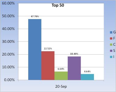
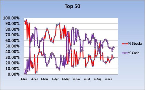
A sizeable measure of cash and lots of bond exposure for the Top 50 this week. That's been the trend. There was not many folks who jumped on stocks when the S&P hit 1040 about 2 weeks ago. And they've gotten more conservative since.
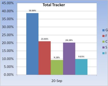
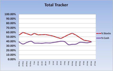
The Total Tracker is not much different. Stock levels continue to drop while cash rises. And again bonds are highly favored. It's hard to ignore this trend in spite of the recent rally.
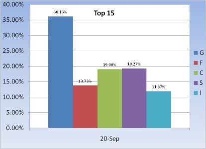
The Top 15 (not by the tracker) continue to have more of an allocation to stocks then we see within the other 2 groups, but it's still not overly aggressive.
The big picture says caution is warranted.
Last year I began to chart our positions in August, but for the balance of the year the Top 50 didn't drop much below an 80% stock position. It was the right "long term" allocation to have. Perhaps that's how we need to look at it.
But the Top 50 also seems to have more than one layer. The difference between #1 and #50 is stark. Currently, #1 has a 24.57% return, while #50 is a respectable 7.28. The difference is more than triple. And #25 is only about 2% higher than #50 with a 9.55% return. Those at the higher levels appear to be trading more effectively than the rest of us. But of course it's only one year, and repeat performances are difficult to achieve.
The Total Tracker however, provides us a current trend view. We can more readily see how the "herd" is reacting. And right now it's trending down in terms of equity exposure. Does that sound like a good contrarian play? The Top 50 isn't too bullish either though. I would have to say that in the longer term view, cash is probably where we want to be. But each of us in free to interpret these charts from our own viewpoints.
With that, let's take a look at how our fellow TSPers are positioned for the new week.


A sizeable measure of cash and lots of bond exposure for the Top 50 this week. That's been the trend. There was not many folks who jumped on stocks when the S&P hit 1040 about 2 weeks ago. And they've gotten more conservative since.


The Total Tracker is not much different. Stock levels continue to drop while cash rises. And again bonds are highly favored. It's hard to ignore this trend in spite of the recent rally.

The Top 15 (not by the tracker) continue to have more of an allocation to stocks then we see within the other 2 groups, but it's still not overly aggressive.
The big picture says caution is warranted.
