This week I'm going to limit the tracker charts to just the trend version and not post allocations. This is so I can upload another chart I'd like to show you this week.
Let's start with one of those charts:
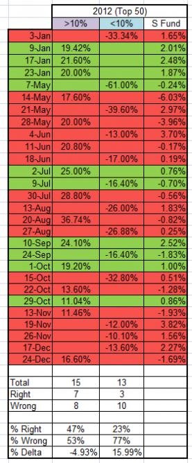
I've mentioned in the recent past that the Top 50 have not had a good track record predicting market direction on a weekly basis (2012) whenever they reduced their stock allocations by more than 10%. This chart captures that information as well as increases in stock exposure of more than 10%.
Here's what you're looking at...
Each week when the Top 50 had an stock allocation shift of 10% or more, I've noted the week, the amount of change in allocation (for either a 10% up or down change) and in the last column, what the S fund did for that week.
Red weeks denote those weeks where the Top 50 shifted allocations in the opposite direction of the market.
Green weeks denote those weeks where the Top 50 shifted allocations correctly with the market.
Towards the bottom of the chart, there's a Total, which denotes how many times during 2012 the Top 50 shifted either up or down 10% or more. Each column for shows the degree of change in stock allocations for a given week.
The number of times the Top 50 was either right or wrong is indicated below the total line.
A percentage of how often the Top 50 was either right or wrong is given at the bottom of the chart. the last line indicates the delta.
The Delta indicates how much the S fund changed for all the weeks the Top 50 had either an increase or decrease in stock allocations. Collectively, for all the weeks where the Top 50 had an increase in stock allocations, the S fund saw a decline of 4.93%. That's not good. But the column that shows a 10% decrease in stock allocations is much more telling.
Collectively, for all the weeks the Top 50 decreased their stock allocations by 10% or more, the market was up 15.99%! I believe that because this is a longer term bull market, large "bearish" moves tended to get punished more severely than large "bullish" moves.
Interesting, isn't it?
Okay, let's look at this week's allocations:
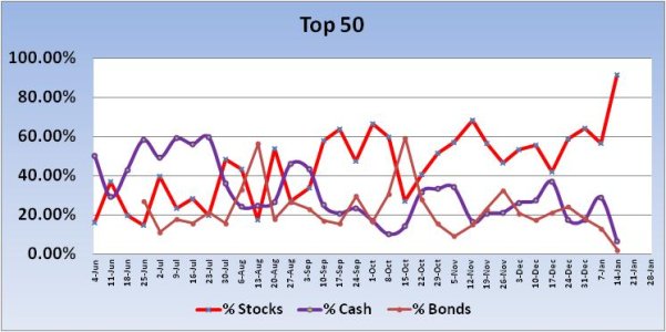
The Top 50 had a bullish shift (increase in stock allocations) of 35.42% going into the new week. That's well above the 10% threshold and suggests we could see a decline in prices this week. But there's a lot of liquidity in this market and I'd not bet the farm on that. This is still a bull market.
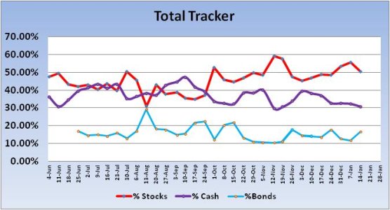
The Total Tracker saw a decrease in total stock allocations of 5.32% going into the new week, from 55.63% last week to 50.3% this week.
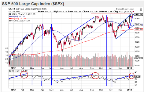
Let's look at a chart of the S&P 500. For this week, I opted to look at a longer term view of this index, mainly because I wanted to see what was going on with this index at this time last year. I used the Relative Strength Index (RSI, bottom of chart) to show any similarities between the 1st quarter in 2012 and the current quarter.
The Relative Strength Index (RSI) is a momentum oscillator that measures speed and change of price movements and oscillates between zero and 100. Generally speaking, RSI is considered overbought when above 70 and oversold when below 30. Using this index we can look for divergences, failure swings and centerline crossovers. I can also use it to simply identify the general trend, which is how I'm using it here.
Notice last year during this time how the RSI steadily climbed with price, reaching an overbought condition in early February (far left red circle). It then tracked sideways with price continuing to chop higher. The first vertical line denotes a sell-off with a corresponding drop in the RSI. There are other vertical lines showing the same thing. During the months of May through September, RSI is showing another upward trend, but it was quite choppy action. Still, the trend was sideways to up. Another overbought condition occured in mid-September (second red circle). After another few weeks of volatility, the market tanked into mid-November. So these overbought conditions do not trigger immediate sell-offs, but they can serve as an early warning.
We are now in another upwardly biased situation, but RSI has not yet reached an overbought condition. Not that it has to, it doesn't. But it does suggest we could see higher prices for awhile longer yet.
There are concerns. We have a rising wedge (bearish) for one and Friday saw a doji form (market indecision and possible reversal signal). Friday also saw price come very close to the intraday peak seen on 14 Sept (red horizontal line on top of chart). I'm thinking this is a good week to see more selling pressure than the market has been able to generate so far this year. But I doubt it will last that long if we get it and it may not go too deep (perhaps 1430-1440 on the S&P).
And don't forget that along with the Top 50 ramping up their stock allocations this week, our sentiment survey came in at 59% bulls to 30% bears. That may be a neutral signal, but not by much and the system remains in the G fund given the sell signal that was triggered the previous week.
Let's start with one of those charts:

I've mentioned in the recent past that the Top 50 have not had a good track record predicting market direction on a weekly basis (2012) whenever they reduced their stock allocations by more than 10%. This chart captures that information as well as increases in stock exposure of more than 10%.
Here's what you're looking at...
Each week when the Top 50 had an stock allocation shift of 10% or more, I've noted the week, the amount of change in allocation (for either a 10% up or down change) and in the last column, what the S fund did for that week.
Red weeks denote those weeks where the Top 50 shifted allocations in the opposite direction of the market.
Green weeks denote those weeks where the Top 50 shifted allocations correctly with the market.
Towards the bottom of the chart, there's a Total, which denotes how many times during 2012 the Top 50 shifted either up or down 10% or more. Each column for shows the degree of change in stock allocations for a given week.
The number of times the Top 50 was either right or wrong is indicated below the total line.
A percentage of how often the Top 50 was either right or wrong is given at the bottom of the chart. the last line indicates the delta.
The Delta indicates how much the S fund changed for all the weeks the Top 50 had either an increase or decrease in stock allocations. Collectively, for all the weeks where the Top 50 had an increase in stock allocations, the S fund saw a decline of 4.93%. That's not good. But the column that shows a 10% decrease in stock allocations is much more telling.
Collectively, for all the weeks the Top 50 decreased their stock allocations by 10% or more, the market was up 15.99%! I believe that because this is a longer term bull market, large "bearish" moves tended to get punished more severely than large "bullish" moves.
Interesting, isn't it?
Okay, let's look at this week's allocations:

The Top 50 had a bullish shift (increase in stock allocations) of 35.42% going into the new week. That's well above the 10% threshold and suggests we could see a decline in prices this week. But there's a lot of liquidity in this market and I'd not bet the farm on that. This is still a bull market.

The Total Tracker saw a decrease in total stock allocations of 5.32% going into the new week, from 55.63% last week to 50.3% this week.

Let's look at a chart of the S&P 500. For this week, I opted to look at a longer term view of this index, mainly because I wanted to see what was going on with this index at this time last year. I used the Relative Strength Index (RSI, bottom of chart) to show any similarities between the 1st quarter in 2012 and the current quarter.
The Relative Strength Index (RSI) is a momentum oscillator that measures speed and change of price movements and oscillates between zero and 100. Generally speaking, RSI is considered overbought when above 70 and oversold when below 30. Using this index we can look for divergences, failure swings and centerline crossovers. I can also use it to simply identify the general trend, which is how I'm using it here.
Notice last year during this time how the RSI steadily climbed with price, reaching an overbought condition in early February (far left red circle). It then tracked sideways with price continuing to chop higher. The first vertical line denotes a sell-off with a corresponding drop in the RSI. There are other vertical lines showing the same thing. During the months of May through September, RSI is showing another upward trend, but it was quite choppy action. Still, the trend was sideways to up. Another overbought condition occured in mid-September (second red circle). After another few weeks of volatility, the market tanked into mid-November. So these overbought conditions do not trigger immediate sell-offs, but they can serve as an early warning.
We are now in another upwardly biased situation, but RSI has not yet reached an overbought condition. Not that it has to, it doesn't. But it does suggest we could see higher prices for awhile longer yet.
There are concerns. We have a rising wedge (bearish) for one and Friday saw a doji form (market indecision and possible reversal signal). Friday also saw price come very close to the intraday peak seen on 14 Sept (red horizontal line on top of chart). I'm thinking this is a good week to see more selling pressure than the market has been able to generate so far this year. But I doubt it will last that long if we get it and it may not go too deep (perhaps 1430-1440 on the S&P).
And don't forget that along with the Top 50 ramping up their stock allocations this week, our sentiment survey came in at 59% bulls to 30% bears. That may be a neutral signal, but not by much and the system remains in the G fund given the sell signal that was triggered the previous week.
