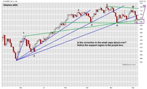
The market has been giving conflicting signals in the last week, so it is difficult to tell what is really going on. A view of the small cap today, reveals that the recent correction may be about over or at least the downside may be limited. Looking at the Wilshire 4500 chart first, we see five advancing waves (12345) since the November 2011 low and three corrective waves (ABC) from the March 2012 high. The pattern seems to be tracing out some sort of ending diagonal or triangle. We see solid support around 675. There is also a support line touching the momentum high at 1 and touching the momentum low at A that limits the decline now.

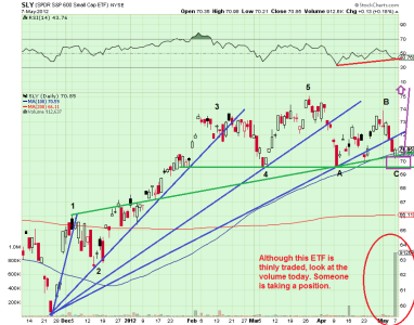
The second chart is SLY, or the S&P 600 Small Cap ETF. This ETF is somewhat thinly traded, but shows a similar pattern to the Wilshire 4500. Again we see some kind of a diagonal or triangle ending pattern with the downside limited. Also notice the trading volume today, as it was huge, compared to the regular daily volume. Looking at another source, I have determined that this is almost all buying volume.

Further considerations:
Small cap can lead. Market breadth has been turning up since April 26[SUP]th[/SUP], and still has not turned down to any degree. Breadth is the framing on a house; it holds everything up when positive. The US dollar looks ready to turn down on the daily and weekly charts, while the Euro looks ready to rally. Contrarian sentiment started to turn up today (market getting too bearish). So, this analysis supports the idea that the SPX 500 cash market decline could be limited. Therefore I may need to reevaluate the 1291-1315 tentative SP 500 path target on my trend cube, if the previous 1258 low holds, or if a higher low is put in place.
On the other hand, you can clearly see head & shoulder patterns on both charts (35B), and a neckline (4A). So, is the glass half full, or half empty?

The second chart is SLY, or the S&P 600 Small Cap ETF. This ETF is somewhat thinly traded, but shows a similar pattern to the Wilshire 4500. Again we see some kind of a diagonal or triangle ending pattern with the downside limited. Also notice the trading volume today, as it was huge, compared to the regular daily volume. Looking at another source, I have determined that this is almost all buying volume.

Further considerations:
Small cap can lead. Market breadth has been turning up since April 26[SUP]th[/SUP], and still has not turned down to any degree. Breadth is the framing on a house; it holds everything up when positive. The US dollar looks ready to turn down on the daily and weekly charts, while the Euro looks ready to rally. Contrarian sentiment started to turn up today (market getting too bearish). So, this analysis supports the idea that the SPX 500 cash market decline could be limited. Therefore I may need to reevaluate the 1291-1315 tentative SP 500 path target on my trend cube, if the previous 1258 low holds, or if a higher low is put in place.
On the other hand, you can clearly see head & shoulder patterns on both charts (35B), and a neckline (4A). So, is the glass half full, or half empty?
