-
The Forum works well on MOBILE devices without an app: Just go to: https://forum.tsptalk.com
-
Please read our AutoTracker policy on the IFT deadline and remaining active. Thanks!
-
$ - Premium Service Content (Info) | AutoTracker Monthly Winners | Is Gmail et al, Blocking Our emails?
Find us on: Facebook & X | Posting Copyrighted Material
-
Join the TSP Talk AutoTracker: How to Get Started | Login | Main AutoTracker Page
You are using an out of date browser. It may not display this or other websites correctly.
You should upgrade or use an alternative browser.
You should upgrade or use an alternative browser.
JTH's Account Talk
- Thread starter JTH
- Start date
FogSailing
Market Veteran
- Reaction score
- 61
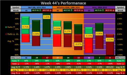
I like the top part of the chart JTH. I think it tells me that in Week 44, the S&P is up an average of 71% of the time (based on the Wkly Count data below).. If Week 43 was up, Week 44 is up .04% of the time, if Week 43 was down, Week 44 was up an average of 1.65%. I guess we're looking at a tough week coming up. Same goes for the W4500 and AGG. However, it looks like S&P is the place to be regardless this week.
I am unsure about Weekly Count number 41. I think you are telling me that if we are up in Week 44, the average up is 1.72% and the average down is 1.48%. The ratio is 68:32 so almost a 2 to 1 chance of it being a positive week.
Thanks JTH!
FS
I am unsure about Weekly Count number 41. I think you are telling me that if we are up in Week 44, the average up is 1.72% and the average down is 1.48%. The ratio is 68:32 so almost a 2 to 1 chance of it being a positive week.
Thanks JTH!
FS
JTH
TSP Legend
- Reaction score
- 1,319
I like the top part of the chart JTH. I think it tells me that in Week 44, the S&P is up an average of 71% of the time (based on the Wkly Count data below).. If Week 43 was up, Week 44 is up .04% of the time, if Week 43 was down, Week 44 was up an average of 1.65%. I guess we're looking at a tough week coming up. Same goes for the W4500 and AGG. However, it looks like S&P is the place to be regardless this week.
I am unsure about Weekly Count number 41. I think you are telling me that if we are up in Week 44, the average up is 1.72% and the average down is 1.48%. The ratio is 68:32 so almost a 2 to 1 chance of it being a positive week.
Thanks JTH!
FS
Thank you for the feedback, the weekly count 41 is the total range of week 44s covered (from 1974-2014) For the next column over, at weekly count 24, this just counted the weeks where week 43 had closed up, but it's still within the 41 week range. I see what you are saying, I need to find a way to make sure folks don't confuse 41 weeks, with an actual week 41.
Still looking for ways to cram as much data in as possible, yet still let the reader understand what the statistical data means to them. I think you understood it very well, and I hope others come to the same conclusion.
O
OBXTrader
Guest
Thanks JTH, that's a lot of work you are putting out there for FREE. I for one appreciate it and do have money still working in the market for the very reasons you have mentioned. I went G Fund on the 23rd, but with interest, not much of difference had I stayed in L2020/L Income. October was great considering I was never more than 50% invested in TSP to protect my wealth in case it was a counter-trend rally in a bear market. But, starting tomorrow, I have more IFT's.
Last week was almost coin toss the S&P being positive. If the stock market had been open 5 minutes longer, last week might have been a negative and it would be a different read for tomorrow/next week on your charts.
Another interesting observation concerns Monday follow through from Friday market action. (don't shoot me if I am wrong). Looking back at September and October, on six of eight weeks if Friday was up, down or relatively flat so was the following Monday the same. The exceptions were September 18-21 downtrend small dead cat bounce and the post-Labor Day rally on September 8th.
Thank you for the feedback, the weekly count 41 is the total range of week 44s covered (from 1974-2014) For the next column over, at weekly count 24, this just counted the weeks where week 43 had closed up, but it's still within the 41 week range. I see what you are saying, I need to find a way to make sure folks don't confuse 41 weeks, with an actual week 41.
Still looking for ways to cram as much data in as possible, yet still let the reader understand what the statistical data means to them. I think you understood it very well, and I hope others come to the same conclusion.
Last edited:
Khotso
Market Veteran
- Reaction score
- 27
Looking for some feed back, does this chart make sense? Can you understand what it is saying?
View attachment 35790
Nice -- No -- great chart J.
Yeah, it's telling me that it's probably good I'm not in F and that I should probably be in C instead of S given my risk tolerance.
Some feedback:
The S&P 500 column heading should be 1974-2014, no?
The columns on the bottom half of the chart aren't self-explanatory. Instead of Wkly Count, maybe consider something like # of Weeks (Total/Up/Down). You might be able to change the cell height for the headings row to fit that all in.
Now the biggie, can you post this now for the remaining weeks this year? :smile: That would be awesome. Or maybe you should publish it on your own website and get something out of it.
JTH
TSP Legend
- Reaction score
- 1,319
Another interesting observation concerns Monday follow through from Friday market action. (don't shoot me if I am wrong). Looking back at September and October, on six of eight weeks if Friday was up, down or relatively flat so was the following Monday the same. The exceptions were September 18-21 downtrend small dead cat bounce and the post-Labor Day rally on September 8th.
Thank you OBXTrader, and I agree, there are definite repeating patterns which can be found on Mondays-Fridays, there are also patterns on the smaller timeframes, but it takes a lot more money to capitalize on smaller percentage moves.
Nice -- No -- great chart J.
Yeah, it's telling me that it's probably good I'm not in F and that I should probably be in C instead of S given my risk tolerance.
Some feedback:
The S&P 500 column heading should be 1974-2014, no?
The columns on the bottom half of the chart aren't self-explanatory. Instead of Wkly Count, maybe consider something like # of Weeks (Total/Up/Down). You might be able to change the cell height for the headings row to fit that all in.
Now the biggie, can you post this now for the remaining weeks this year? :smile: That would be awesome. Or maybe you should publish it on your own website and get something out of it.
Thank you for the feedback, lol I don't have charts for the remaining weeks of the year, that data has to be drawn out 1 chart at a time. I can tell you this, I have back-tested statistical data across multiple timeshares within the GFCS historical data and I've yet to find the magic bullet.
Even though I haven't had success with statistical systems, I do believe they provide value to the long-term investor who needs confirmation on long-term moves.
2015 was a beta year for me, just getting the ALPAFS & ESD systems on the auto tracker showed me how many flaws there are to work out. Creating rules on the fly and dealing with the unexpected on a live by wire system, has taught me a great deal, mainly that I still have much to learn
Mcqlives
Market Veteran
- Reaction score
- 24
TI can tell you this, I have back-tested statistical data across multiple timeshares within the GFCS historical data and I've yet to find the magic bullet.
Even though I haven't had success with statistical systems, I do believe they provide value to the long-term investor who needs confirmation on long-term moves....

I just partially quoted you...but what I have learned, mostly the hard way, is that the trends, like the recent relationship between Friday and Monday, seem to disappear as soon as I notice it. I look for the long term symmetry and leading indicators as about the best I can hope for. That said, there are several people posting here (you included) that I read every single post no matter if the information doesn't match what I have come up with. All knowledge helps me make decisions which, hopefully, net in a gain! Thanks for all you do!
-mcq
ps...I like your most recent percentage charting. Very concise and self-explanatory for a quick review of year over year trends.
JTH
TSP Legend
- Reaction score
- 1,319
ps...I like your most recent percentage charting. Very concise and self-explanatory for a quick review of year over year trends.
Thanks MCQ, and I'm glad to see (thus far) it's been a productive day for the markets.
I'm headed to my new home in Europe this week, please take care of the markets in my absence
The ESD system will move from the S-Fund to the the F-Fund CoB Thursday
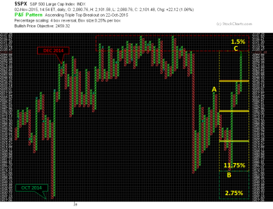
ALPAFS is still on a buy, it's been a great run, just 1.5% left to go before we meet the 52-week highs, hard to believe, but true and undeniable...

FogSailing
Market Veteran
- Reaction score
- 61
OK JTH...we'll expect the real skinny on the European markets now that you're going to be there....
Thanks for today's update...always appreciated.
FS
Thanks for today's update...always appreciated.
FS
Mcqlives
Market Veteran
- Reaction score
- 24
I'm headed to my new home in Europe this week, please take care of the markets in my absence
If you are in Central Europe go to Worms and Berchtesgaden, Germany, if you get a chance. Far ends of the country from each other but beautiful in their own way. Works is one of the best Octoberfests I made it to and Merchtesgaden, besides ski slopes and Hitler's Salt mine, has St. Bartholomew's on Lake Konigssee and they used to serve an amazing brew!
JTH
TSP Legend
- Reaction score
- 1,319
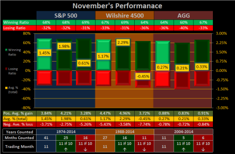
Never done messin with stuff, here's the revised version.
Did my best to get as much info in there as possible, while keeping the fonts big (for the older folks) and staying within the size limitations for posting in the forum. If anyone is color blind, and having issues, please let me know.
This one is for November

Did my best to get as much info in there as possible, while keeping the fonts big (for the older folks) and staying within the size limitations for posting in the forum. If anyone is color blind, and having issues, please let me know.
This one is for November

burrocrat
TSP Talk Royalty
- Reaction score
- 162
Never done messin with stuff, here's the revised version.
Did my best to get as much info in there as possible, while keeping the fonts big (for the older folks) and staying within the size limitations for posting in the forum. If anyone is color blind, and having issues, please let me know.
This one is for November
View attachment 35810
that reads a whole lot better with that color scheme. what is the difference between light green/dark green and light red/dark red mean on the bars though?
RealMoneyIssues
TSP Legend
- Reaction score
- 101
Check for misspellings 
Sent from my (Daughter forcing me to use an) iPhone using Tapatalk...
Sent from my (Daughter forcing me to use an) iPhone using Tapatalk...
JTH
TSP Legend
- Reaction score
- 1,319
that reads a whole lot better with that color scheme. what is the difference between light green/dark green and light red/dark red mean on the bars though?
THe lighter colors reflect all the stats, whlie the darker colors filter out the previous month closing up or down. Follow the colors to the bottom of the chart. Example: "11 if 10 closes ↑", meaning November's stats if October closed up. Only counting the Months of November where October closed positive.
Check for misspellings
Ha, smy spelling sux, youd caught me!
Sent from my (Daughter forcing me to use an) iPhone using Tapatalk...
burrocrat
TSP Talk Royalty
- Reaction score
- 162
THe lighter colors reflect all the stats, whlie the darker colors filter out the previous month closing up or down. Follow the colors to the bottom of the chart. Example: "11 if 10 closes ↑", meaning November's stats if October closed up. Only counting the Months of November where October closed positive.
View attachment 35811
aahhh, got it.
rktect1
TSP Analyst
- Reaction score
- 11
A great architect , Ludwig Mies van der Rohe, once said "Less is more." To which another great architect, Frank Lloyd Wright, responded "Less is only more, where more is no good."
I know you put a lot of time, energy and thought into all of this jth but sometimes there seems to be so much.
I know you put a lot of time, energy and thought into all of this jth but sometimes there seems to be so much.
burrocrat
TSP Talk Royalty
- Reaction score
- 162
A great architect , Ludwig Mies van der Rohe, once said "Less is more." To which another great architect, Frank Lloyd Wright, responded "Less is only more, where more is no good."
I know you put a lot of time, energy and thought into all of this jth but sometimes there seems to be so much.
well at least you didn't go with pei. i could never make form or function out of his stuff.
JTH
TSP Legend
- Reaction score
- 1,319
A great architect , Ludwig Mies van der Rohe, once said "Less is more." To which another great architect, Frank Lloyd Wright, responded "Less is only more, where more is no good."
I know you put a lot of time, energy and thought into all of this jth but sometimes there seems to be so much.
Thanks, I'm going to keep the data as is, but you gave me another idea, which I believe will simply the chart.
Mcqlives
Market Veteran
- Reaction score
- 24
Thanks, I'm going to keep the data as is, but you gave me another idea, which I believe will simply the chart.
Your November graph makes me feel better about being 100% S. I know that this is just a big game form of gambling but at least I don't feel like I put it all on green...more like playing a 12 deck game of black-jack and not being able to keep track of more than 2 decks worth of the cards.
Between your graph and Bquat's charts I almost feel like I see the big picture. Thanks again for charting!
Lakebound
TSP Analyst
- Reaction score
- 8
THe lighter colors reflect all the stats, whlie the darker colors filter out the previous month closing up or down. Follow the colors to the bottom of the chart. Example: "11 if 10 closes ↑", meaning November's stats if October closed up. Only counting the Months of November where October closed positive.
View attachment 35811
SUBSCRIBED.

Frank
Similar threads
- Replies
- 0
- Views
- 219
- Article
- Replies
- 0
- Views
- 99
- Replies
- 0
- Views
- 158

