It's time to take a look at how our fellow TSPers are allocated going into the new week. I had mentioned previously that stock allocations were rising, while cash was dropping. That does appear to be the case. Here's the charts:
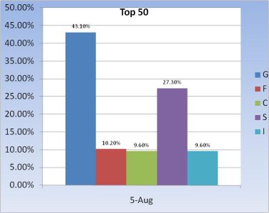
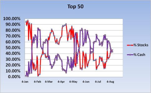
The Top 50 have been increasing their stock allocation for the past week or so, although total allocation is still a bit under 50%.
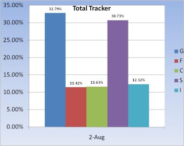
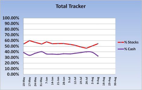
These are the charts I pay the most attention to now. We can easily see that stock allocations are rising for the 2nd straight week.
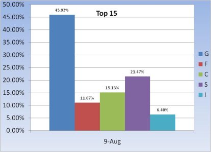
The Top 15 have a similar allocation to the Top 50.
Overall, we appear to be getting a bit more bullish, but I aside from some volatility to shake weaker hands loose, I would think we have more room to move higher.


The Top 50 have been increasing their stock allocation for the past week or so, although total allocation is still a bit under 50%.


These are the charts I pay the most attention to now. We can easily see that stock allocations are rising for the 2nd straight week.

The Top 15 have a similar allocation to the Top 50.
Overall, we appear to be getting a bit more bullish, but I aside from some volatility to shake weaker hands loose, I would think we have more room to move higher.
