The Trend
Using EMA Ribbons to identify strength.
Using EMA Ribbons to identify strength.
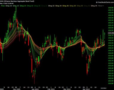
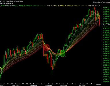
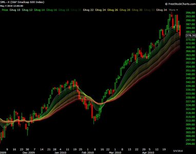
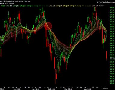
One of the great things about EMA ribbons is their ability to help identify changes in trend. When EMA ribbons consolidate together it usually means the trend is changing direction, or we are in for some sideways action. Here are some 6 month charts with 20 different EMAs ranging from 10 to 50. In the same order, they are color coded starting from light green, transitioning to yellow, then to red.
Looking at AGG we can see the EMAs are trading close together indicating consolidation with a lack of commitment in either direction.
On the S&P 500 I've circled the changes in trend direction, based on the EMA crossovers. Within the green circle you will notice how tightly the EMAs were braided together, just before prices broke out.
For the S&P 600 small caps you'll notice the same things, only I'll point out how liitle damage the EMAs have taken as of this moment.
For EFA I've circled the previous EMA crossover back in late January. You may notice the same thing is happening now.
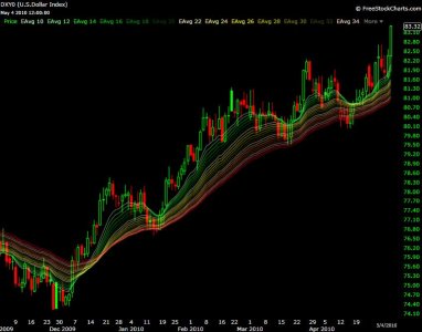
Compared to all the other EMA ribbons, the dollar looks to be the healthiest on the 6 month charts.
Sorry for the blurry pictures, when I add more colors it tends to ramp up the file size, exceeding the forum's size limit. For those of you who may be interested in throwing some of your own symbols over an EMA ribbon, feel free to click here.
Good luck and stay nimbal out there, the 1st week of May tends to get rough....Jason
