Looking at the big picture we can see we've taken on some extensive damage. People are starting to get some legitimate fear in them and that's a good thing because we need some fear to produce enough capitulation to form a bottom. Someone told my dad the Dow Jones Industrials had crashed and that's just the type of fear I love to hear. I want this market to run out of panicky sellers, after that's all said and done then there's nothing left to do but to buy. As I like to tell folks "You can't predict how the markets are going to react, but you can predict how you react to the markets." When it comes to these markets I'm humbled knowing I can't even see six minutes into the future. The only thing I can do is learn from the past and apply it to the present.
At present, the charts have pulled back deeply enough to where I think it's safe to call this a correction. The Transports have lost -9.15% which is just shy of the 10% standard. Below, The Big Picture shows the Transports as the weakest of the indexes, but the good news is the Wilshire 4500 is the strongest (strongest of the weakest.) But I'm guessing this doesn't give you that warm fuzzy feeling inside, so lets move to the chart below.
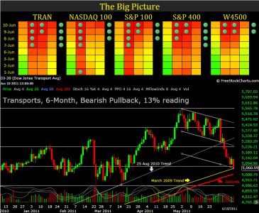
Above, we can see the Transports have retraced over 75% of the 6-month chart. That's a bear market within this timeframe. But if you were to look at this on a 1-year chart you'd see it's only retraced 30% within the 1-year timeframe, so it's not as bad as it looks. We just happen to have a great deal of consolidation at these levels. Check out the March 2009 trendline and the 200SMA just below that. These are going to be key areas of support so don't be surprised to see them get tested. If we break below those levels, it's going to shake a whole lotta monkeys out of the tree and we could enter a 2008 free-fall. I'm not saying (nor thinking) it's going to happen, I just want everyone to be aware of these levels and their importance.
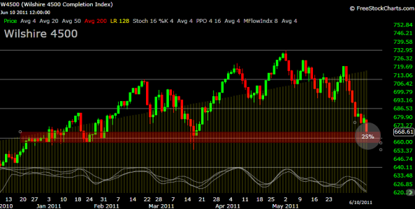
As for the Wilshire 4500 (the S-Fund) we can see we have a lot of price noise within the red box so we really want these levels to hold (duh.) This week I've added the yellow 128-day linear price bars to show where median price is. We can see how far we've deviated from this line, in a perfect world we'd get a snap-back rally taking us back to and perhaps above the linear bars.
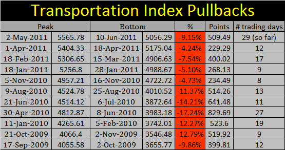
Light & Long. I'm using this term to describe the latest pullback when compared to the previous pullbacks over the last two years. Study the data below and you'll see what I'm talking about. Over the last two years, over the last 12 pullbacks, this pullback has been average (percent ranking #7, point ranking #6) but the duration of time has been the longest (ranking #1 in time with 29 days) hence the term light and long.
If everything goes according to plan, I could be out anywhere from Tuesday to Friday, possibly staying longer if the price action is good. If the plan falls apart, then I'll either absorb the loss and bail to the F-Fund, or stick it out for what could be a very long time. If you haven't already, check out the S&P 500/Bond yield data I posted in my previous blog, it's good data to know.
Take care, stay nimble, and trade safe...Jason
At present, the charts have pulled back deeply enough to where I think it's safe to call this a correction. The Transports have lost -9.15% which is just shy of the 10% standard. Below, The Big Picture shows the Transports as the weakest of the indexes, but the good news is the Wilshire 4500 is the strongest (strongest of the weakest.) But I'm guessing this doesn't give you that warm fuzzy feeling inside, so lets move to the chart below.

Above, we can see the Transports have retraced over 75% of the 6-month chart. That's a bear market within this timeframe. But if you were to look at this on a 1-year chart you'd see it's only retraced 30% within the 1-year timeframe, so it's not as bad as it looks. We just happen to have a great deal of consolidation at these levels. Check out the March 2009 trendline and the 200SMA just below that. These are going to be key areas of support so don't be surprised to see them get tested. If we break below those levels, it's going to shake a whole lotta monkeys out of the tree and we could enter a 2008 free-fall. I'm not saying (nor thinking) it's going to happen, I just want everyone to be aware of these levels and their importance.
As for the Wilshire 4500 (the S-Fund) we can see we have a lot of price noise within the red box so we really want these levels to hold (duh.) This week I've added the yellow 128-day linear price bars to show where median price is. We can see how far we've deviated from this line, in a perfect world we'd get a snap-back rally taking us back to and perhaps above the linear bars.

Light & Long. I'm using this term to describe the latest pullback when compared to the previous pullbacks over the last two years. Study the data below and you'll see what I'm talking about. Over the last two years, over the last 12 pullbacks, this pullback has been average (percent ranking #7, point ranking #6) but the duration of time has been the longest (ranking #1 in time with 29 days) hence the term light and long.

If everything goes according to plan, I could be out anywhere from Tuesday to Friday, possibly staying longer if the price action is good. If the plan falls apart, then I'll either absorb the loss and bail to the F-Fund, or stick it out for what could be a very long time. If you haven't already, check out the S&P 500/Bond yield data I posted in my previous blog, it's good data to know.
Take care, stay nimble, and trade safe...Jason
