Short & to the point
It might be hard to believe, but last Friday the S&P 500 closed down -2.72% off the 2 May 52 week high, and price is trading at 83% of it's 6-Month high/low range. So while we ponder this 3-week downside bias, let's keep in mind the dominant trend is still to the upside.
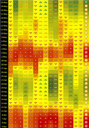
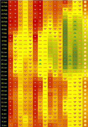
I'm going to make this week's blog short, I've got lot's to do and nothing in the market to worry about. Pictured below is yet another system I use to measure buying & selling opportunities. I came up with the concept last year, but until recently didn't have a way to present the data to you. This is not a system I use exclusively, it's one of many I use, the trick is to know how to incorporate them together and that's something I've been working on. On the far right side, green circles identify buying opportunities, while red circles identify selling opportunities. Because this is a bull market it will be typical to see more sell signals than buy signals, but the buy signals are going to be more accurate. If we were in a bear market, the inverse would be true.
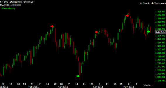
FYI, 20 May triggered a buy, the second buy triggered this year. The buy trigger is what it is, trade it at your own risk.
The system.


The arrows on this S&P 500 YTD Daily chart show where the triggers are.

Take care and trade safe...Jason
