JTH's Account Talk

Thank you kind sir.

If we close in the green today, then I've met about 2/3rds of the price objective, meaning the plan executed precisely as I had hoped. IMHO, looking at my statistical data and the current charts, when we close out the month, I do not believe we will close above the Feb highs. Thus, with the risk to reward ratio (as I see it), I felt it was in my best interest to take the exit. We'll see how that decision looks at the end of the month.

I am still in SPX and pleased to hear your analysis!

Hope you are not full of it! :cheesy:

I had it pegged at Tuesday, but I can do Monday...Thanks!!!

I still don't believe we will close above the Feb highs, but hey it doesn't matter what I think, only how I react.

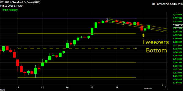
An encouraging sign, is the tweezers bottom on the hourly chart, I find this to be a good buy signal on this timeframe. For today, I'd guesstimate we'll close flat to down, because I'd find it hard to believe investors would want to stay in over the weekend. But all we have to do today is survive, and let the news prop up the markets for us over the weekend.
2016-07-D-MISC5.png
 
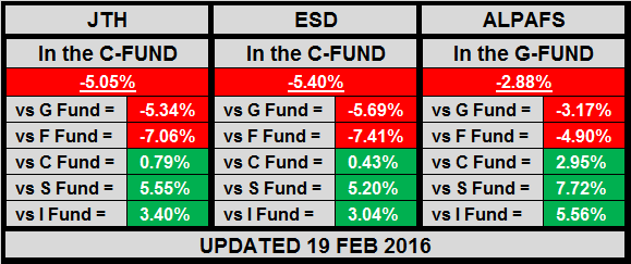
For myself, I’m currently jailed in the G-Fund, up 4.00% MTD and down -5.05% YTD
This marks the first time this year where all 3 systems are outperforming the CSI funds. I was fortunate to time the Feb bottom, hitch a 3-day 5.42% ride, then bail out, but there's still much work to be done, and many more short-term wins that need to be racked up before the year is over.

2016-08-D-JTH.png


Trading the Stats:*Week 8
 
Congrats on being in at the right time Jason. Now let's try to pick up the last bit of change on the table later this month before the bikers bust up the bar..:D:D:D

FS
 
Looking for some feedback on the new charting format.

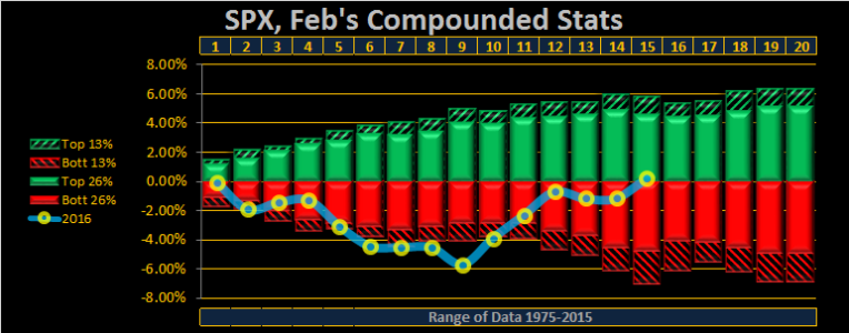
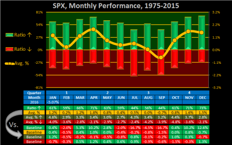
I try my best to make charts quick to read and easy to understand, but with statistics, they can easily be misinterpreted without the proper frame of reference, thus I've chosen to add more data. It's not enough to know what the winning ratio of an index is, if you don't know how it compares with the baseline of all data referenced. Therefore, I've added a statistical baseline which comprises the entirety of all data used on a particular timeframe. As an example, SPX February has a 59% winning ratio, this is -2% below the baseline of all Months. With the baseline data, the reader will understand how February compares with all months of the year, over the past 41 years.

2016-08-D-MISC.png
 
Good evening

Thank you everyone for the feedback on the previous post.

Under the PNF ALPAF settings, both SPX & W4500 have now established an uptrend. This means SPX/W4500/TRAN/NDX are firing on all cylinders, so for now, the short-term looks healthy.

Here's the ranking in order of strength.
__TRAN - Intermediate uptrend, 7 Higher highs, with 3 higher lows (a higher triple low, higher double low, and higher low)
__NDX - Short-Intermediate uptrend, 2 Higher highs, 2 higher lows
__SPX - Short-term uptrend, 1 higher high, with 1 higher low
__W4500 - Short-term uptrend, 1 higher high, with 1 higher low

2016-08-D-MISC1.png
 
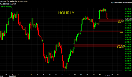
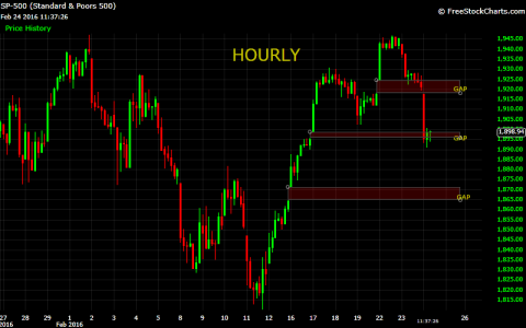
And look where that third gap is...right at the 1865 - 1870 area. Hmm...As I said on Fogsailings thread, I'm a buyer at 1870. I've got one IFT left for February, so if it happens this week, I can jump in, or I'm ok with waiting until March if that's what it takes...This is going to be fun! :D
 
And look where that third gap is...right at the 1865 - 1870 area. Hmm...As I said on Fogsailings thread, I'm a buyer at 1870. I've got one IFT left for February, so if it happens this week, I can jump in, or I'm ok with waiting until March if that's what it takes...This is going to be fun! :D

Tracking YOUR moves on this on RF! I've got one IFT as well, hope to grab a bounce before march.
 
Due to **Oil** falling Euro markets close was not pretty. Any rally in oil will push SPX back up, and it may recover on its own as this has been the case in the recent past.

What triggers the connect / disconnect?

My guess is Computer programming most likely suspect.
 
Tracking YOUR moves on this on RF! I've got one IFT as well, hope to grab a bounce before march.

Good to know you are along for the ride. It would be nice if we can get this trade in before the end of the month, but if we have to wait until March, that's ok. I was a little concerned as it seemed that oil had decoupled from the market, but with todays action, oil and stocks are back in sync. I heard on FBN that the agreement OPEC was trying to strike is once again in jeopardy as Iran does not want to curb it's output and Saudi Arabia does not want to lose market share. If the deal falls apart, that could just be the catalyst to drive oil prices into the $25 per barrel range and we will get that 1870 or perhaps lower. It's going to be fun to watch no matter which way it goes...:D
 
Hii JTH, I'm not sure I fully understand this chart. do the red/green bars represent average win/loss ratios for 12 Months for 40 years shown? I can see how chart shows Green win ratios presented numerically in table below. Would suggest row added to table showing average "ratio % down" for the 12 months, although not necessary as it would just be 100 minus win ratio. Does the yellow line represent the average earnings in that month over 40 years?

Thank you...great work!

Looking for some feedback on the new charting format.

I try my best to make charts quick to read and easy to understand, but with statistics, they can easily be misinterpreted without the proper frame of reference, thus I've chosen to add more data. It's not enough to know what the winning ratio of an index is, if you don't know how it compares with the baseline of all data referenced. Therefore, I've added a statistical baseline which comprises the entirety of all data used on a particular timeframe. As an example, SPX February has a 59% winning ratio, this is -2% below the baseline of all Months. With the baseline data, the reader will understand how February compares with all months of the year, over the past 41 years.

View attachment 37195
 
Last edited:
Looking for some feedback on the new charting format.

I try my best to make charts quick to read and easy to understand, but with statistics, they can easily be misinterpreted without the proper frame of reference, thus I've chosen to add more data. It's not enough to know what the winning ratio of an index is, if you don't know how it compares with the baseline of all data referenced. Therefore, I've added a statistical baseline which comprises the entirety of all data used on a particular timeframe. As an example, SPX February has a 59% winning ratio, this is -2% below the baseline of all Months. With the baseline data, the reader will understand how February compares with all months of the year, over the past 41 years.

Hii JTH, I'm not sure I fully understand this chart. do the red/green bars represent average win/loss ratios for 12 Months for 40 years shown? I can see how chart shows Green win ratios presented numerically in table below. Would suggest row added to table showing average "ratio % down" for the 12 months, although not necessary as it would just be 100 minus win ratio. Does the yellow line represent the average earnings in that month over 40 years?

Thank you...great work!

Hi DBA, thank you for asking, I think the below info covers the question, but I'm not certain, so please let me know if it doesn't.

In this case, for the month of March:

1) The green bar has a 66% winning ratio, meaning over the past 41 Marches, it has closed up 27 times.
2) The red bar has a 34% losing ratio, meaning over the past 41 Marches, it has closed down 14 times.
3) The Yellow line is the average monthly returns of all 41 months of March at 1.2%
4) The average % up at 3.3% (not shown in the graph) is the average of all 27 positive months of March.
5) The average % down at -2.8% (not shown in the graph) is the average of all 14 negative months of March.
6) The baseline represents how each month compares with the averages for all months of the year, over the past 41 years.


2016-08-D-MISC.png
 
Needful to get back up over that resistance or the next level of support is another gap (closed) @ SPX 1865.

But I can make some gains in the F fund in the meantime!
 
JTH-ALPAFS IFT EoB Today, from 100C to 100G

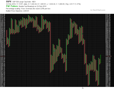
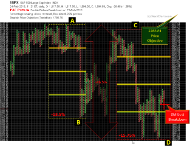
SPX/TRAN/NDX have double bottom breakdowns, this is because the previous bottom wave column of Os was short, which made for an easy bearish trigger. Regardless, I will place the system where it should go.

2016-08-D-MISC5.png
 
Got home late this evening, so I'm just catching up with you.

I'm not a Gap specialist, but gapping below an open gap, probably means this 1920 are holds some sort of significance. As we can see, the second gap is now filled.

2016-08-D-MISC6.png
 
JTH-ESD IFT EoB Today, from 100G to 100S

Setting up for March (as previously discussed in my blog)
 
Good night

ALPAFS got a better than expected exit, while ESD got a less than expected entry.

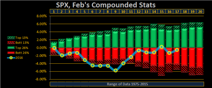
SPX MTD -.55%

2016-08-D-MISC8.png
 
Back
Top