InsaneZane1
Investor
- Reaction score
- 2
Last year, I decided to resurrect my Ameritrade account, which collapsed to almost nothing at all before I decided to use my 2011 tax return to attempt to resurrect it. With the resurrection came a stronger interest in learning some new strategies I could pick up for my own investment decisions. I'm glad I finally started to learn a lot more about the US stock markets, because what I learned from those recent experiences supplemented by paying close attention to the musings of professional investors who boast of 25%+ returns on investment carried over directly into my TSP account. With the help, somewhat, of dumb luck, my TSP account appreciated 21.58% in 2012 (50% if you include personal and agency-matching contributions). Well, it wasn't exactly dumb. You see, I started to follow a few expert investors who all focus specifically on the S&P 500. This gives me a lot more insight into the S-Fund than I ever used to have. Still, I rarely ever bothered to check up on my TSP account, let alone manage it, more than maybe a few times throughout the entire 2012 calendar year. This is why I believe the performance of my account in 2012 is just as much a result of dumb luck as it was a calculated decision based on the knowledge I acquired from those experts over the last year.
Much of my past TSP contributions/allocations have put at least a little bit of money into all of the different funds, with a heavier emphasis on the funds that appeared to be trending upward the most on the TSP's charts. As a result, I never even invested more than 25-30% into any single fund at any time last year. But there's always been one thing about the TSP website that has always bothered me. It lacks any charts that I am so used to referring to when making decisions on what to buy or sell on my Ameritrade account. I'm used to not only seeing charts that show basic volatility of any stock I want to look at, but also being able to see trend lines and other indicators to help give me good ideas on what stocks to trade and exactly when to trade them.
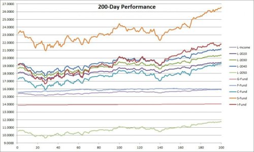
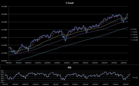
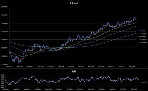
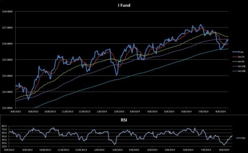
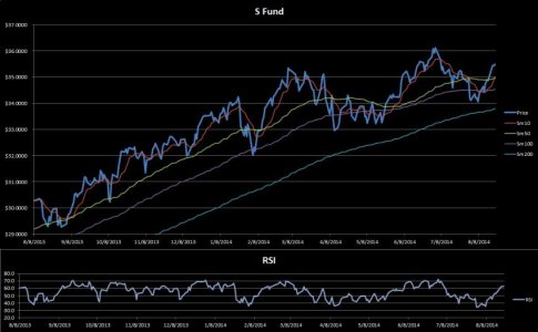
I decided a few weeks ago to start doing something about this problem. Since I love working with Excel, I decided to create a spreadsheet that I could use to input the raw data (daily share prices) and allow it to automatically give me the visual information that I really want to be seeing. It's still a work in progress. I created some basic line charts initially to help get a better visual of trends to follow. Those charts were too basic, however, and I had too much going on at the time to put any effort into making the charts better to work with and also automated so that I wouldn't have to keep modifying the source data for the charts on a daily basis. I eventually scrapped the charts altogether, but I plan to bring them back - and I know exactly how I think I will set them up to function automatically. All I need to do is input the raw data straight from the TSP website.
With or without charts, I really needed to have something to work with to help me make IFT and allocation decisions. Since I love to make use of 10-day and 50-day Simple Moving Average trend lines with stocks, I decided to create a simple table in my new spreadsheet to show me how all of the TSP funds have been doing over various trading periods. I created rows for 10-day, 20-day, 50-day, 100-day, and 200-day trends. It was easy for me to create the table and even to make it function automatically. Between the daily (or mostly daily) inputs of raw data and built-in conditional formatting settings in the table, I now have a table that gives me a great idea on exactly how well all of the TSP funds have been doing at various times within the last 200 trading days. This gives me the ability to track both short-term and long-term trends, which I'm hoping will allow me to decide when to make what kind of IFT. It's going to be a work in progress, however, as the short-term volatility has thus far made it very difficult for me to make a good decision on exactly how much of my money to put in which funds without pushing the ridiculous 2x/month limits that the TSP has on IFTs. I swear, this limit is specifically why I didn't pay much attention to my TSP account in the last year. It's also why I've decided I'd much rather move all of my money into my Ameritrade account so I can decide as often as I please what to do with my money. If it wasn't for agency-matching contributions, I would have already completely abandoned my TSP account in favor of putting all of it into my Ameritrade account.
Well, the situation is what it is though. I'm not about to pass on a chance at getting "free" money, so I have chosen to continue to allocate 5-6% of my income to my TSP account so that I will get the maximum benefit of agency matching. Okay, so enough with the rambling about all this. I'm new to this site but it appears that this forum is intended for us to post our thought processes as they pertain to our own accounts. Well, the above represents my basic thoughts on the TSP in general and why I allocated/moved my funds the way I did. So where does this leave me now? What is this new spreadsheet telling me now that I intend to use to make decisions with my TSP account?
I haven't bothered yet to put enough raw data into my spreadsheet to give me any 200-day trends, but I did input enough to obtain 10-, 20-, 50-, and 100-day trends. Over the longer 3 periods, the S fund has done considerably well - even more so in the last 50 trading days than in the last 100 (12.63% increase vs. 10.48%). The S and C funds have been running neck and neck for the lead over the last 10 periods. The C fund has even done very well in the last 20 periods yet the S fund is still the hands down winner in anything longer than 10 periods. I like to focus more attention on shorter-term trends but the 10-day trend alone is too volatile. So I've decided to factor in the 20-day trends as well in the hopes that it will help smooth out some of that shorter-term volatility and help me decide when to do an IFT.
Now that I know that some funds are clearly performing better than others over both the short and long terms, I've decided to focus my money specifically on the 4 funds that have had the best overall trends and will avoid the funds that are growing at the slowest rates (or might even be declining). I expect to experience some volatility in everything, but I think the overall trends will best help me decide on what to do with my money. At the moment, I have my money in the following: S-Fund (35%), I-Fund (30%), C-Fund (20%) and L-2050 (15%). I seriously considered moving money away from the I-Fund tomorrow because it's the 2nd slowest grower over the last 20 trading days and is the only one to be negative over the last 10 periods. I'm really not sure how soon I want to make that decision, however, as I just did an IFT on Friday and I don't want to burn my only other IFT for the month the very next day with data that I still need to fine-tune. I've decided to give it a few more days so I can give my data a chance to stabilize enough to allow changes in my data to be apparent less frequently. In short, I'm trying to settle down some of the leap-frogging that has been going on since I started working with this spreadsheet before I decide to burn my only remaining IFT for the month on a potentially bad move.
I intend to eventually share this spreadsheet with anybody who might be interested in using it but I'd like to first get the important part of it a little more stable, as well as re-introduce functioning (and automated) charts to help visualize trends.

