
Forming a Bottom?

thumbnail.jpg

I'm running late this evening so I'm going straight to the charts:
NAMO-NYMO.jpg

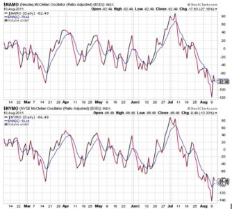
NAMO and NYMO both reversed a bit today, with NAMO flipping back to a sell, while NYMO remained on a buy. This is actually healthy action after yesterday's rally as it's consistent with a bottom "possibly" forming.
NAHL-NYHL.jpg

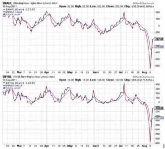
NAHL and NYHL actually moved higher today, which I thought was odd, but it could also support the notion that we really are forming a bottom.
TRIN-TRINQ.jpg

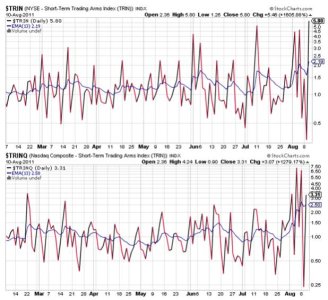
Yesterday I had mentioned that TRIN and TRINQ were highly suggestive of imminent weakness, and we got that today. Now they are back to a very oversold condition and are very suggestive of another rally coming very soon (tomorrow more than likely).
BPCOMPQ.png

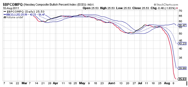
This is where things get a bit interesting. BPCOMPQ looks to be trying to form a bottom as it turned a bit today. It's still very low and is telling me that the market is still oversold in a longer time frame.

So while the system remains in a sell condition, the signals really look to be pointing to a bottoming process in progress. I remain 100% S and I'm still looking to lighten up. The thing to be aware of is that if a bottom is being put in, it's probably only short term (within 2 weeks or so). That's my guess. And the top could be higher than many expect. Perhaps in the mid 1200s for the S&P 500 (1250 or so). But I'm not going to hold a full stock position indefinitley should we begin an up-leg here. If the S&P 500 can get near 1200, I'll begin to raise cash at that point. At least that's my present plan.
 
http://finance.yahoo.com/echarts?s=...on;ohlcvalues=0;logscale=off;source=undefined

I don't know if anyone has an interest in chart information but I use this simple chart information to help people that won’t a quick reference to see what direction the market is going. The Slow Stochastic is my favorite, but the Fast Stochastic gives a good day indicator. A crossover of the blue line on top of the red line is a buy - a crossover of the blue line below the red line is a sell. The RSI lets a person see if we are at the top or bottom of the cycle. The Moving Averages (50,100,200) act as support or resistance depending on what side of the moving average the market chart is on. The crossover of the 50 MA below the 100 MA gives us additional information on what direction the marketis going. I recommend this because this sight takes people to the yahoo sight. This can be added by going to the interactive chart and selecting technical indicators drop down and select the indicators above. I don't know how to link this but you can copy and paste to browser and it will pull it up. I recommend this along with the TSPTALK web site as tools to use. I am not a market professional only passing along simple additional tools I have been tought over the years. If your computer will not pull up interactive charts you can still do it through the basic tech. analysis on the left of the page the only change will be the color of the line on the Stochastic the red line changes to green.
 
Last edited:
Back
Top