Since the first 6 weeks of the year, which saw a correction of more than 10% across most global equity indexes, stocks have come roaring back. It's now been more than 7 weeks since the low and the S&P 500 is holding above both its 50 and 200 day moving averages. That's bullish at face value, but let's check under the hood.

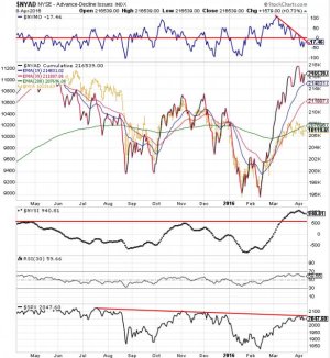
This chart gives us an idea of what some of the internals show with respect to the New York Stock Exchange (NYSE), which is one the best representative indexes in taking the pulse of the stock market.
The first part of the chart shows the McClellan Oscillator (NYMO), which is a momentum indicator derived from Net Advances; that is the number of advancing issues less the number of declining issues. Subtracting the 39-day exponential moving average of Net Advances from the 19-day exponential moving average of Net Advances forms the oscillator's signal line. We can see that momentum by this measure peaked in March and went negative at the beginning of April, which is bearish and has resulted in recent weakness across the broader market.
The second chart shows us the NYSE Advance-Decline Line, which is the cumulative total of the daily NYSE advancers minus the daily NYSE decliners. It is one of THE most important market breadth indicators. Breadth hit a double bottom in the January-February time frame and peaked (so far) in late March. It now appears to be struggling to move higher. The yellow line represents the NYSE Composite (NYA), which is a stock market index covering all common stock listed on the New York Stock Exchange. It is now struggling to get back above the 200 day EMA (green line).
The third chart shows us the Summation Index for the NYSE (NYSI), which rises when the McClellan Oscillator is positive and falls when the McClellan Oscillator is negative. Extended positive numbers in the McClellan Oscillator cause the Summation Index to trend higher. We can see that this signal peaked in early April and is at a high not seen since July of 2014. This Summation Index is important for identifying intermediate to longer term trends as it is a slower version of the McClellan Oscillator.
At face value, this index suggests that an intermediate term top may be in, but it can rise higher.
The fourth chart is RSI (relative strength). I have it set to an intermediate term setting. It reached a relative peak over the past few weeks, but did not get overbought. However, overbought on the current setting is uncommon for this chart. The last time it was overbought was July of 2014.
The last chart is the S&P 500, which shows a longer term down trend, but that trend has been relatively gradual.
Overall, the NYSE seems to indicate that caution is warranted if you're a bull. But this is not a market driven by market fundamentals. It is driven by central bank intervention in a global economy that has been showing signs of cracking for quite some time. And that intervention distorts reality.
The bottom line is that the market "should" be ready for a decent pullback at any time, but that liquidity can always be ramped up (intervention) to save it from falling. I find that cumulative breadth is a very good indicator for determining when liquidity is flowing into (or out of) the market. They track almost in sync.
For now, we'll just have to see how much longer this market can continue to defy gravity.
