I started tracking the top 25% of TSP folks on the tracker earlier this month and thought I'd show you where they currently stand in two charts.
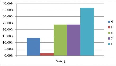
This chart shows how the top 25% are allocated by fund. Virtually no one in this group is invested in the L funds. Since I started keeping track about two weeks ago, the allocation shown in this chart has been consistent with relatively modest changes over time.

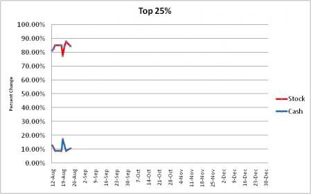
The same holds true for this chart. The red line shows the total amount of funds the top 25% have allocated to stocks. The blue line shows their collective cash position. Again, relatively minor changes have been noted.

This chart shows how the top 25% are allocated by fund. Virtually no one in this group is invested in the L funds. Since I started keeping track about two weeks ago, the allocation shown in this chart has been consistent with relatively modest changes over time.

The same holds true for this chart. The red line shows the total amount of funds the top 25% have allocated to stocks. The blue line shows their collective cash position. Again, relatively minor changes have been noted.

