Another week, another score for the bulls. As one of the lone bears out there I still find it hard to press a bullish case when only a few sectors (or stocks) choose to partake in this ever weakening rally. If not for Google's tax loophole (which in my opinion is outright fraud) the NDX would have finished negative for the week. Another kick save for the bulls as the divergences and insider selling continue to widen.
Note: All charts courtesy of www.stockcharts.com
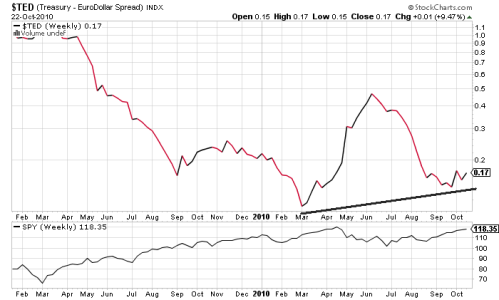
First off, the TED Spread. A rising TED spread means liquidity is drying up or that the risk of default is rising. Housing has not left us, as the editorials on the last page the past 10 months have finally made it to the front page after foreclosures have been halted. Where has the stimulus come from? Easy answer: the deadbeats who haven't made a house payment in over a year but still live in their house. I wonder how many of these losers have $100+ monthy iPhone plans? The TED is the best way to follow the austerity mess/controversy in the eurozone.
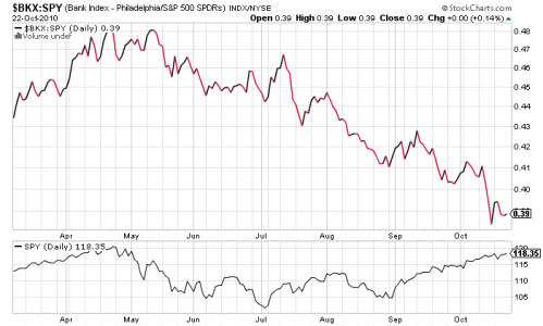
Next, a few updated charts from the week's past entries. Nothing new here. The rats continue to flee the ship. Below is the Philadelphia Bank Index-SPY ratio. As the gurus said in 2006 when it began, we cannot do it without the banks. Would you buy this chart?
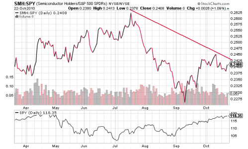
Semiconductors have always been a market leader for the simple fact that it all starts with a microprocessor. Notice the high made in April with INTC's earnings. Was that another spike in October with INTC's repeat blowout earnings?
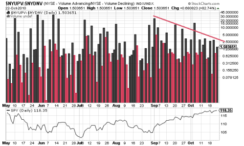
Volume has been a talk for this entire rally and while much trading takes place in dark pools these days, the NYSE volume should all still be relative. The chart below is the ratio of up volume to down volume. Where has the upside volume gone?
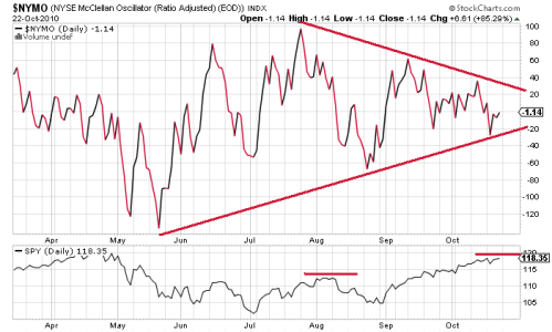
Finally, a fan favorite the NYSE McClellan Oscillator. Basically, you want this thing to be above the zero line as the market makes goes higher. Like all other indicators and oscillators, divergences matter. Though it does have higher lows, the highs have yet to register. Again, would you buy this chart?
Bulls continually look forward to QE2, republican elections, stimulus, tax breaks and Christmas spending but the inherent issues seem to fall on deaf ears. Those who only follow the SPX or other major index may see a possible stalling of a long term rally. A look under the hood shows a market that is rotting internally as the smart investors use any bit of strength to sell to the retail crowd.
Note: All charts courtesy of www.stockcharts.com
First off, the TED Spread. A rising TED spread means liquidity is drying up or that the risk of default is rising. Housing has not left us, as the editorials on the last page the past 10 months have finally made it to the front page after foreclosures have been halted. Where has the stimulus come from? Easy answer: the deadbeats who haven't made a house payment in over a year but still live in their house. I wonder how many of these losers have $100+ monthy iPhone plans? The TED is the best way to follow the austerity mess/controversy in the eurozone.

Next, a few updated charts from the week's past entries. Nothing new here. The rats continue to flee the ship. Below is the Philadelphia Bank Index-SPY ratio. As the gurus said in 2006 when it began, we cannot do it without the banks. Would you buy this chart?

Semiconductors have always been a market leader for the simple fact that it all starts with a microprocessor. Notice the high made in April with INTC's earnings. Was that another spike in October with INTC's repeat blowout earnings?

Volume has been a talk for this entire rally and while much trading takes place in dark pools these days, the NYSE volume should all still be relative. The chart below is the ratio of up volume to down volume. Where has the upside volume gone?

Finally, a fan favorite the NYSE McClellan Oscillator. Basically, you want this thing to be above the zero line as the market makes goes higher. Like all other indicators and oscillators, divergences matter. Though it does have higher lows, the highs have yet to register. Again, would you buy this chart?

Bulls continually look forward to QE2, republican elections, stimulus, tax breaks and Christmas spending but the inherent issues seem to fall on deaf ears. Those who only follow the SPX or other major index may see a possible stalling of a long term rally. A look under the hood shows a market that is rotting internally as the smart investors use any bit of strength to sell to the retail crowd.
